Artichoke
They say you can’t judge a book by its cover, but what about a magazine?
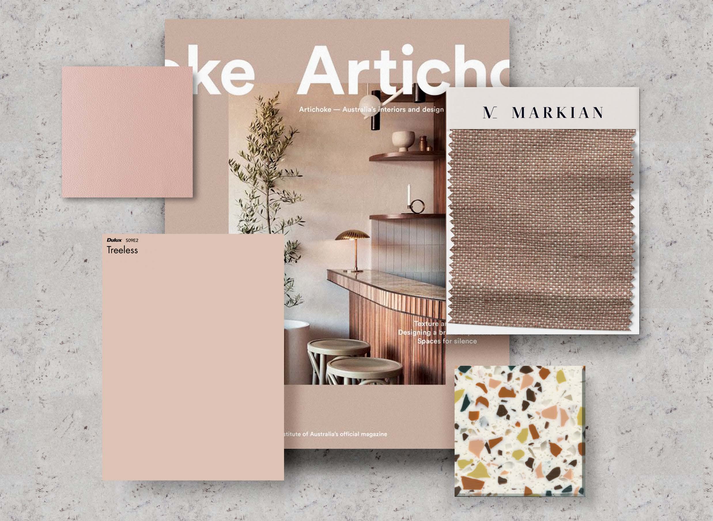
The Artichoke cover showcases exactly what’s beneath its surface. Formulaic in nature, a hero image and its corresponding texture is wrapped in a colour-saturated cover, accented with the iconic Artichoke lettering. This blueprint is what makes Artichoke so distinctive and enticing. Drawing upon the elements of the Artichoke cover - hue, texture, and form - and translating them into a physical space has been the inspiration for the Markian x Artichoke stand. We’ve collaborated with some of Australia’s biggest suppliers, Dulux, Warwick, and Laminex, to showcase and reflect the best Australia has to offer in interior architecture.
Taking cue from both the Australian landscape, and Artichoke cover colours, the colour palette feels iconically Australian, which feels fitting considering Artichoke is Australia’s most respected interior architecture and design magazine. Beginning with Dulux’s Russett Tan, inspired by issue 75, we’re taken on a journey to Australia’s red centre where Uluru, and the iron-rich rusting rocks create the red dirt so synonymous with our country. From there, we see the colour of issue 70, and Dulux Treeless, in the pink of the saline Lake Hellier, in the breasts of the native Galah, the clay of the earth, and splashed across the sky at sundown.
Australia’s lush, leafy rainforests, eucalyptus leaves, and green pastures made Dulux Black Water and issue 60 the next obvious choice. And finally, influenced by issue 60 we settled on Dulux’s Vast Escape, evoking our beautiful beaches and the relentless sunshine that Australia is known for. With this in mind, we created a custom Marblo by Markian block, consisting of a smattering of chips in this colour palette, which is used as a subtle thread throughout the space.
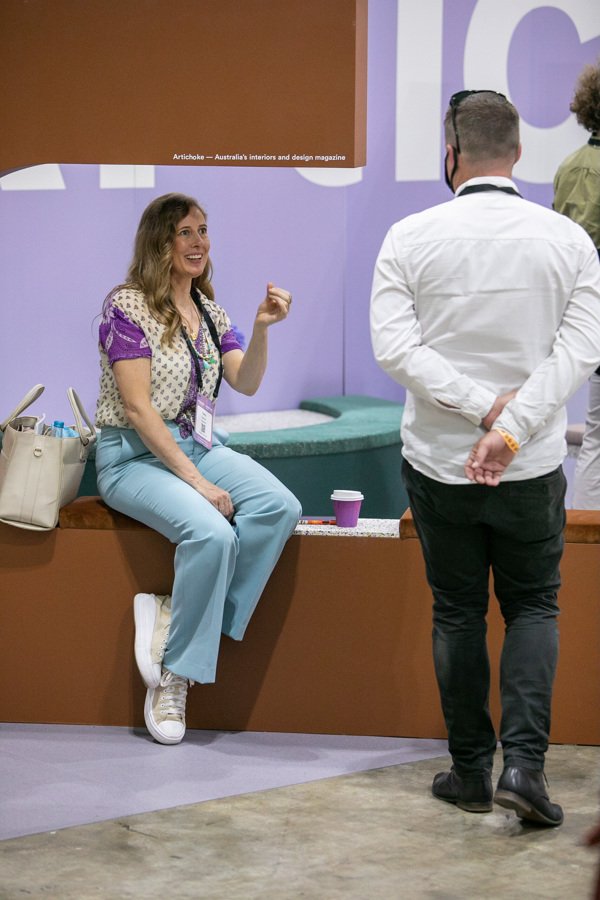
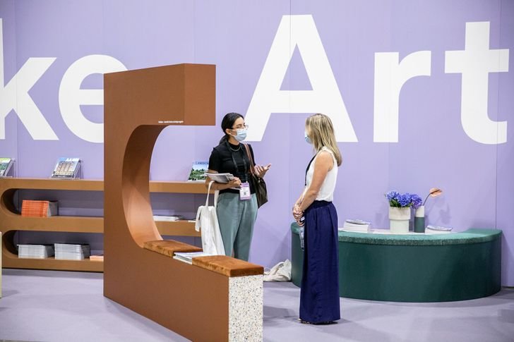
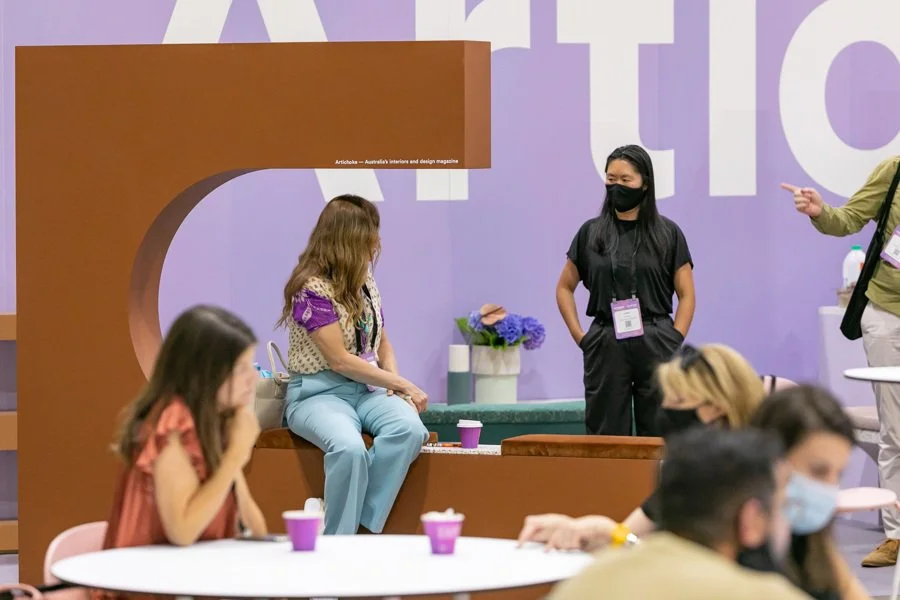
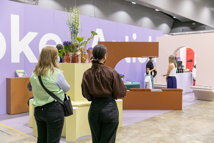
These colours will each feature on one of the seating options of the stand, a circular bench with a central pillar, a half arch that can be lounged on, a half circle with upholstery and space to place merchandise and an arch way with perchs that allow for a delineation from the lounge area and the coffee station.
Akin to the cover of Artichoke, we’ve utilised different textures and finishes to further enhance the sensory experience of the space. Juxtaposing luxuriously soft Warwick fabrics with smooth, hard colour drenched highlights the same contrasting qualities of the gloss and satin on Artichoke’s cover. The archway between the backlit logo will be clad in Laminex Korten, and it’s metallic finish appears almost rust-like, providing an element of tactility that will surprise and delight. This archway will feature space to stack the latest Artichoke release and will tie into the ‘cover’ behind.
Looking at the Artichoke typography as reference, the cut-off ‘O’ on the cover is a familiar motif for the Markian brand. The namesake of our inaugural range, Vieira, meaning scallop in Spanish, has seen us interpret the different elements of the shell throughout the collection. This overlap between Artichoke and Markian has informed the smooth arches, symmetry, and grooved edges found in the furniture and custom pieces of the stand.
Type: Exhibition Design
Services: Commercial Interior Design
Completed: 2022
Client: Architecture Media